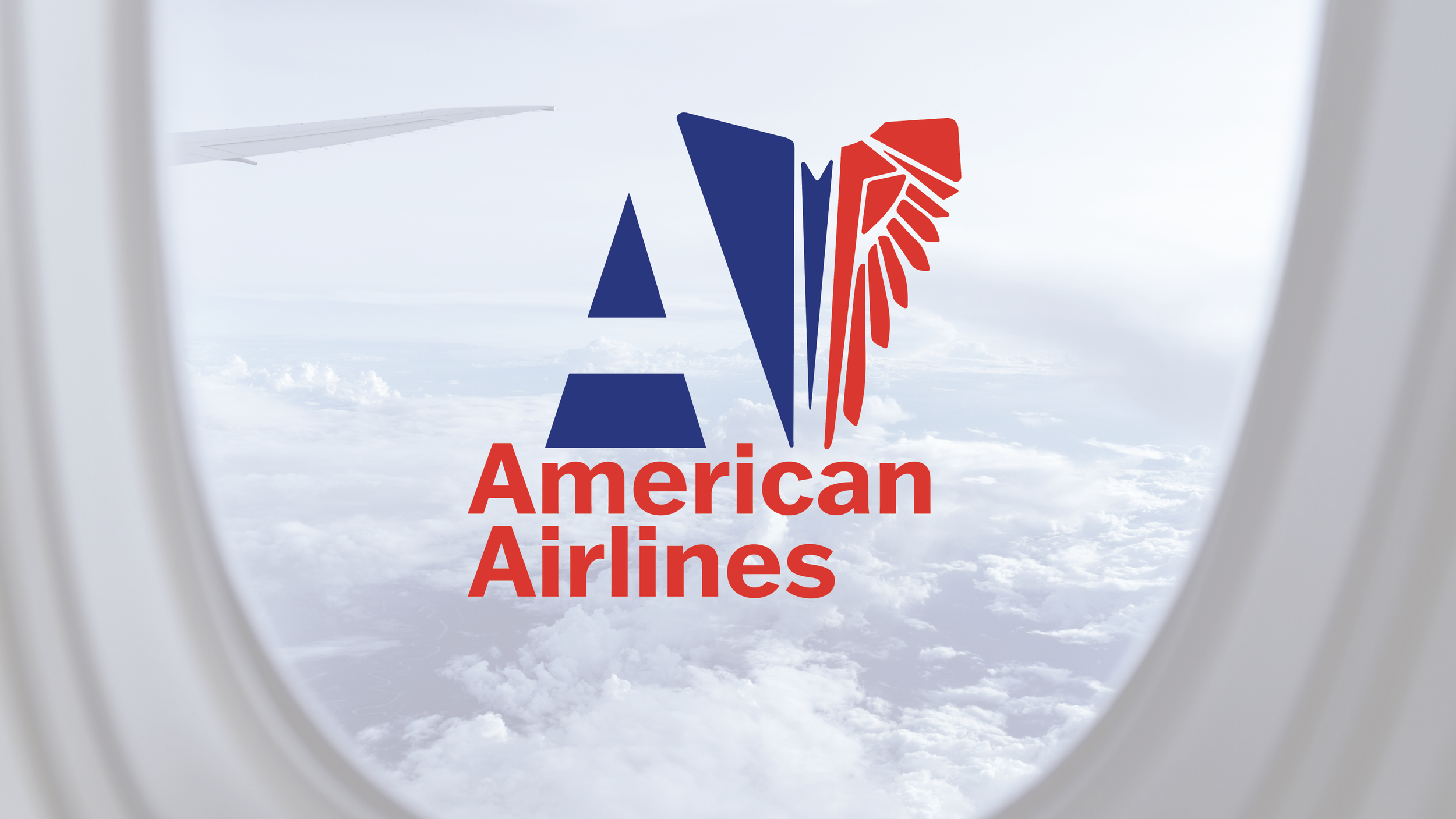
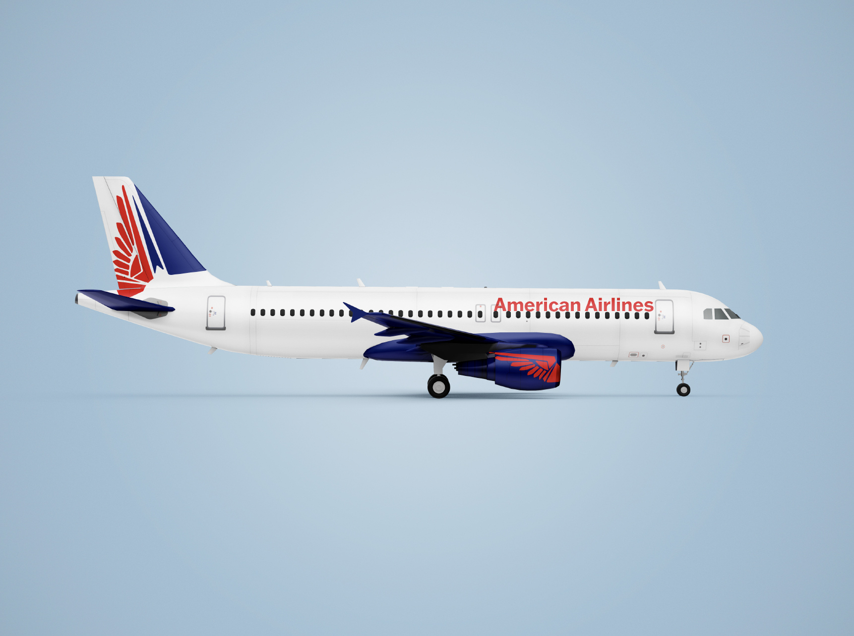
American Airlines Rebrand
Problem:
For my Identity Systems Design class, I was tasked with rebranding a corporate identity system, considering how the logo and identity are experienced in the real world. I chose to take a closer look at American Airlines.
Solution:
I aimed to blend the timeless iconic eagle's wing with the playfulness of a paper airplane. This concept reflects both the strength and authenticity that define the airline. For me, American Airlines symbolizes the idea that "together we fly," whether for a business trip or the adventure that awaits. The rebrand captures the spirit of connection, trust, and excitement, offering a fresh yet familiar visual identity that resonates with passengers on every journey.